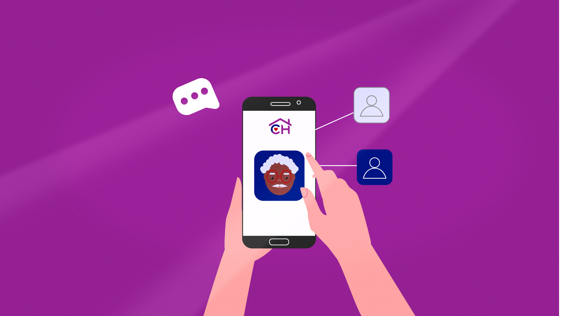
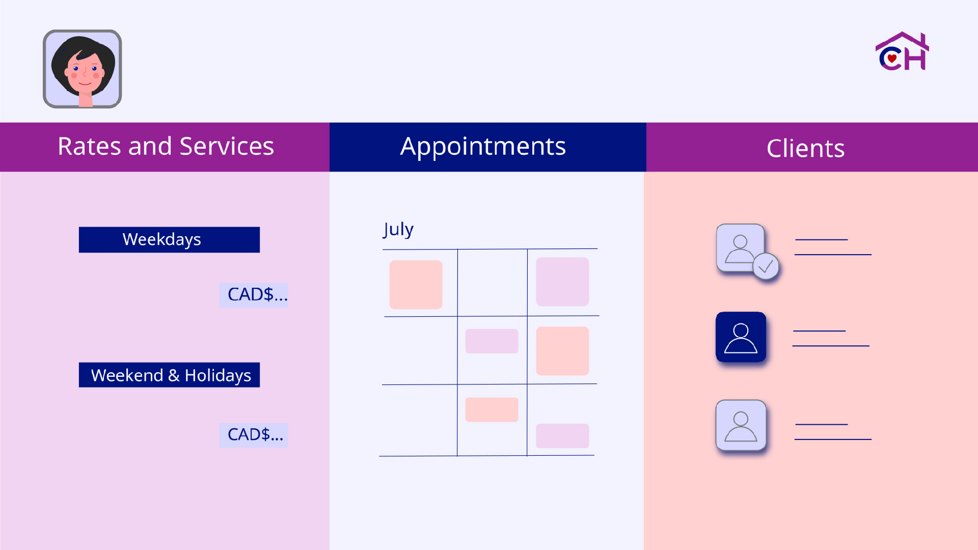
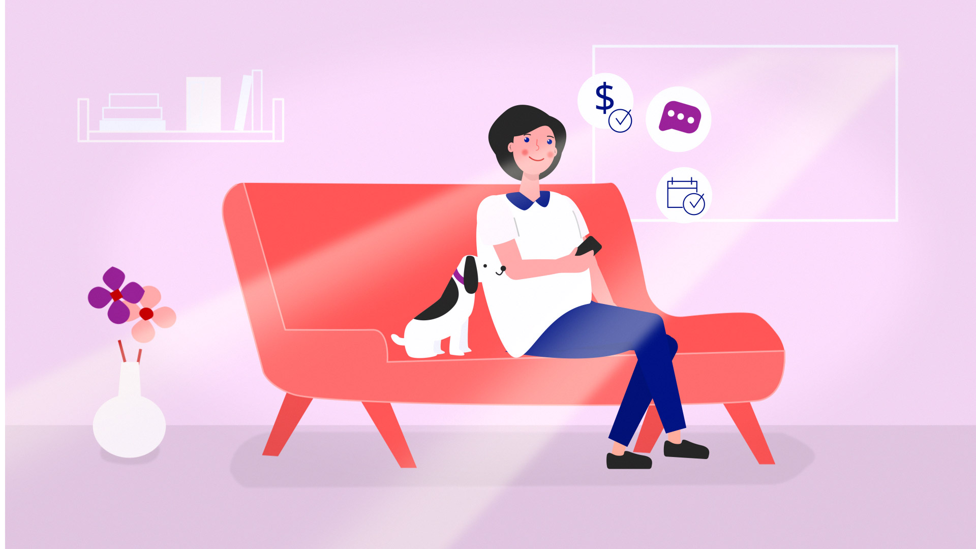
The goal on this project was to show prospective CareHubble Home Care Providers how the platform works and to highlight how CareHubble is different from other home care agencies and online platforms.
The style I aimed for was flat 2D design. Colours had to follow the brand guide lines and overall use of colours had to be warm and fresh. The design meant to be care oriented and had no use of medical references, the character had to look more gender natural to attract wider range of customers.